

Product Design: MyShoperon
Designing and building an online platform streamlining package receiving for high-rise residential buildings.
Background
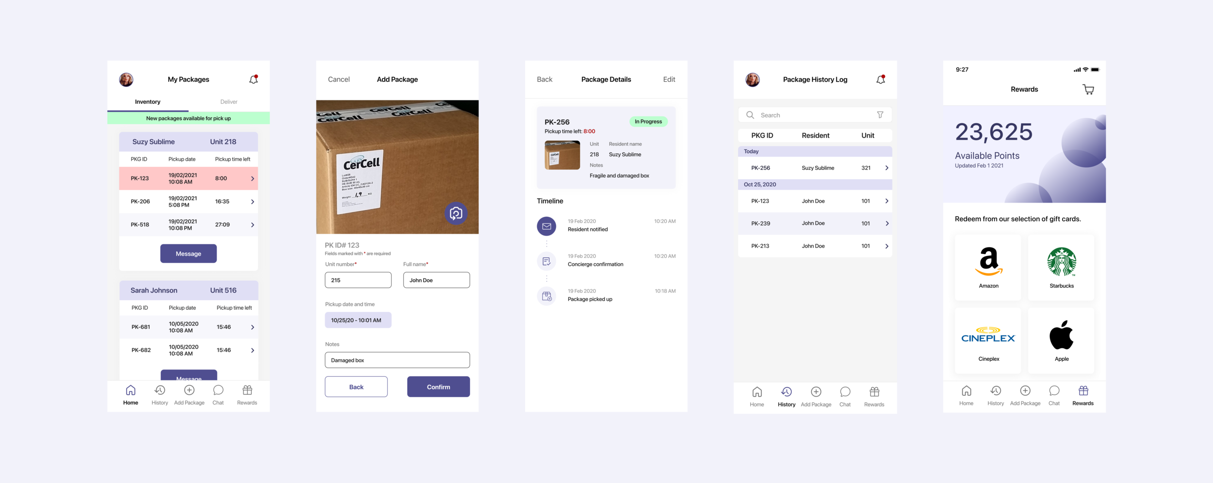
MyShoperon alleviates buildings’ package management issue and takes a multiplayer ecosystem approach to create a platform that connects neighbours to collect packages for each other. During COVID-19, there is a 70% increase in package volume, making everyday a peak package season, like Black Friday. There are four main players in the system: Residents, Shoperons, Concierge and Property Manager. I mainly focused on designing the experience and interface for Residents and Shoperons.
Tools Our Team Used
We established a set of standard tools for our team's workflow, including Slack, Jira, and Figma. This strategic decision played a pivotal role in keeping everyone on the same page regarding user and development objectives. It ensured a consistent flow of communication, which in turn facilitated high-quality execution in-line with expectations. As a result, our team operated seamlessly and efficiently.
Frustrations
Canada Post handles nearly half of Toronto's package deliveries. However, a significant challenge arises as many couriers do not utilize the designated lockers; instead, they leave packages outside the mail room or in the concierge area. This practice places additional responsibilities on security and concierge personnel.
Moreover, the shift towards remote work has led to a surge in incoming packages, some of which are bulky, heavy, or contain perishable items. These non-standard deliveries pose storage challenges in traditional mail rooms.
Furthermore, delays in package sorting by concierge and security personnel mean that residents often must wait until their packages are logged into the system or placed in lockers before they can access them. This presents inconveniences for residents eagerly awaiting their deliveries.
Competitive Advantage of MyShoperon
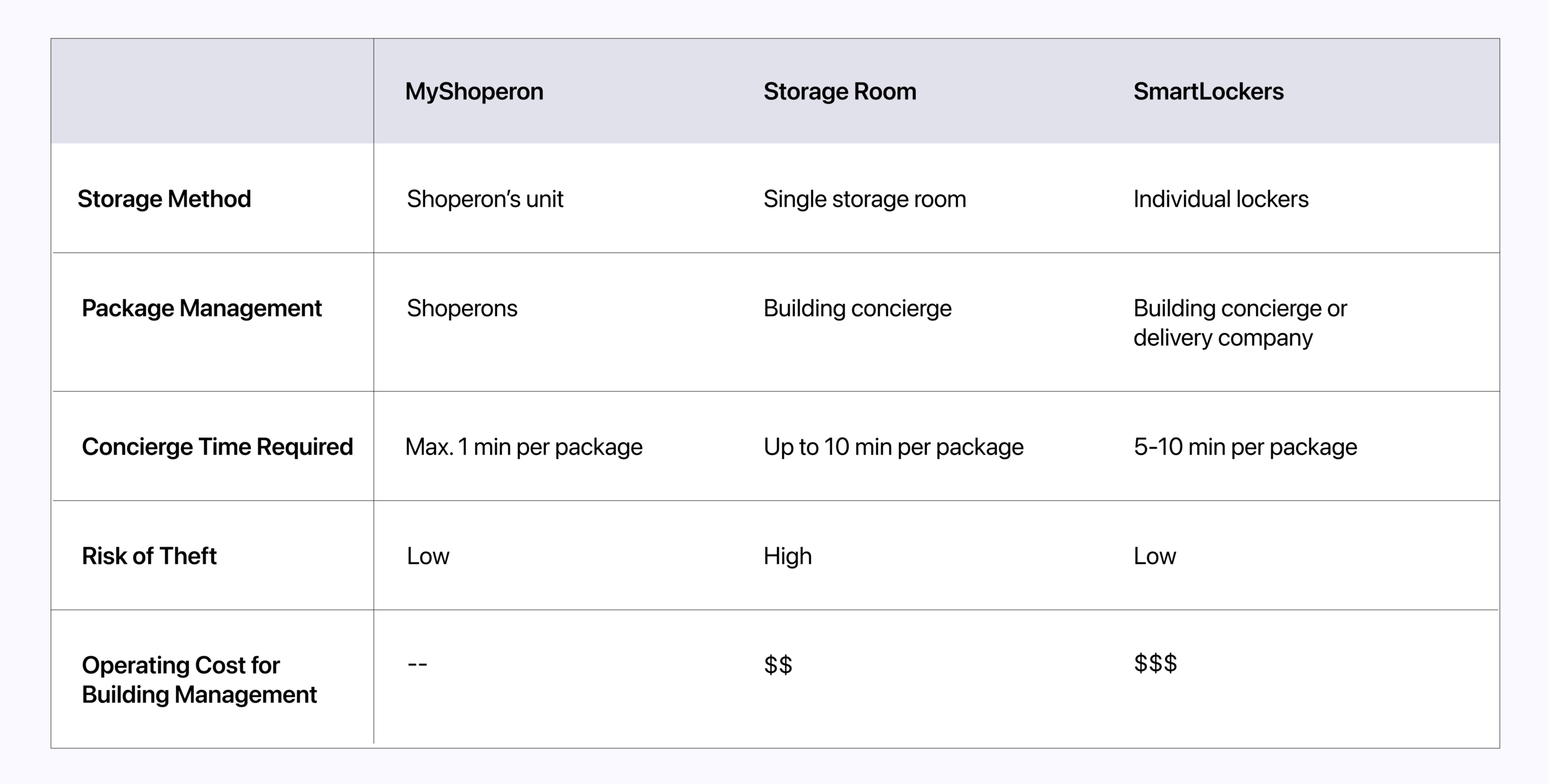
MyShoperon is on a mission to simplify and streamline the package retrieval process for users. In light of this goal, it underscores the utmost importance of maintaining an intuitively easy-to-use app for all participants in the package delivery process. Our commitment to simplicity ensures a seamless experience for everyone involved.
Designing Shoperon’s Rewards Page
Designing the rewards page for Shoperons to redeem their points for gift cards. This is an important feature for MyShoperon because the use of a reward system increases retention and engagement. Redeeming gift cards for delivering packages incentivizes users to continue picking up packages and keeps users on the app.
Design Audit
A design audit is a review on our product to ensure that the company is expressing itself consistently across the platform. It is extremely important to maintain consistency in our design because this has a huge influence on customer experience, and we need to make sure customers receive the same message at any given touchpoint. We did this by analyzing our visual elements and core company message, and did a comparison with what the users are actually seeing and experiencing, through their user journey. Conducting a design audit can help not only create a better experience for our audience, but it also helps the team better understand the direction and goals of the product.
After Audit: Resident’s Experience
After Audit: Shoperon’s Experience
Key Learnings
Simplifying Complex Workflows
When I took a step back to examine the overall design, it became evident that there were certain screens with minor issues and others that were simply unnecessary for the MVP. This realization prompted me to delve into a design audit, where I systematically evaluated each aspect of the platform. Through this process, I identified opportunities to simplify complex workflows and streamline processes, making them significantly more intuitive and efficient for both residents and building staff.
This experience underscores my ability to critically assess and optimize user interfaces, ensuring that the final design serves the most essential user needs and aligns closely with project goals. It demonstrates my commitment to creating practical and user-friendly solutions by eliminating unnecessary complexity and enhancing overall usability.
Wireframing and Prototyping
During the development journey, I found that sketching out fundamental features and user requirements for the rewards process was incredibly valuable. It allowed me to swiftly visualize ideas and concepts in a structured manner. They served as a visual blueprint that significantly aided me in grasping the intended user interface. This process also offered room for creative experimentation. I had the freedom to play around with diverse layouts, navigation approaches, and interaction concepts right from the outset. This early-stage exploration not only fuels creativity but also opens doors to exploring various design possibilities.
While I didn't have the opportunity to test the prototype with real users at that time, I leveraged our development team as stand-ins for users as they did live in high-rise buildings. This helped me gauge functionality and the user journey, ensuring the design I crafted was both practical and user-friendly.